How to Photograph Jewelry

Learning how to photograph jewelry to get the most sales is best achieved with some analysis and planning. Before taking any photos you will first need to consider what your desired goal is. Knowing all your goals for putting photos of your work out there will give you a clear focus on how to take your photos.
Your product photography then can be streamlined into a system that will cover you on every aspect of your business. First let's look at the various areas you will be using your photos:
With that in mind, we can consider what kind of photo styles will best serve each purpose. For example, the photo that will be on your website's home page may do just as well on Pinterest or Instagram, but it may not be the one you will want to send out with your craft festival application.
Let's look at how to photograph jewelry using three different product photography styles that will set you up for success in every area of your business.
How to Photograph Jewelry - 3 Must Have Product Photography Styles
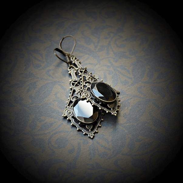
1) Gallery Style Photos: Craft show promoters are usually very particular when it comes to application photos, especially those that fall into the fine craft and juried category. If you are applying to juried shows and you are competing with many jewelry applicants, you will want to adhere strictly to a very clean photo style that is in keeping with the show's current exhibitor photos.
Often, you can get a good idea of the kind of photos a show will be looking for by searching the show's website and looking at the photos from last year's exhibitors. You will see that most juried show photos have a gallery feel to them. Products will often be shot against a plain dark background, one item per shot and they will have excellent lighting and sharp focus.
You may also find photos taken on a pure white background where the product almost seems to be floating. This brings me to the next tip on how to photograph jewelry.
2) White Background Photos: There is a double benefit to photographing on a white background as these photos are quite popular with show promoters as well as magazine editors when it comes to promotion and featured products.
The white background makes it easy to use your photos in advertising campaigns and promotional material because the photo is not framed by a color which restricts the image to a rectangular or square shape. In other words, the white background translates into no background, making it easy to insert your images in between copy and other design elements within the promotional material.
Make sure to take plenty of photos on a white background for your wholesale catalogs or line sheets, magazine submissions for featured product areas as well as for trade show and craft show publicity images.
Having your jewelry on a white background will also allow you to float your images on your wholesale catalogs or line sheets without having any hard frames around your products.
The white background gives you the option to make everything surrounding your product invisible with your editing software. This not only makes for a clean catalog layout, it will allow you to show the detail in your work without anything to distract from the product itself.
Consider taking head-on shots of your jewelry for your catalog or line sheet purposes and angled or more interesting shots for publicity purposes, again all on a white background.

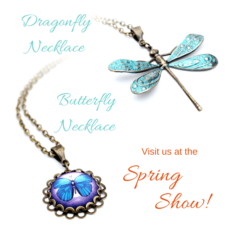
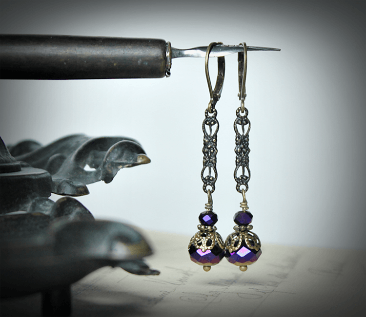
3) Mouthwatering Branding Photos: Now we get to the fun part. This product photography style is all about creating desire. These are the photos that make people take a second look, share your images and save your product to favorites.
You will use these images on your website, your blog, your Etsy shop, Facebook posts and ads, Pinterest, Instagram and other social media sites. Create interest in your photos by using angled shots, close cropping, background props, live models and mood enhancing elements.
Introducing props does not mean you have to fill your photo with lots of stuff. In fact you really want to carefully choose one or two elements that will add mood, yet not distract the viewer from the main star of the image... your jewelry!

As an example, I want to share how a simple ad in a Lowe's flyer captured my attention and had me analyzing why the photo had such impact. If I could show you the image I would.
The ad is a simple photo for a flooring company with a close shot of nicely dressed up bed with a side table. Very simple, but what was so neat is that they used a pair of high healed sandals next to the night stand as a prop. The shoes look as though they had just been slipped off next to the bed.
The lighting in the room suggests that it is a bright and sunny day. There are fresh flowers on the night stand and a large sea coral, again suggesting summertime.
Now, I know that not everyone will have the same response as I did to the ad, but this is an example of the kind of effect you can have when you put a little thought into the feeling of your photos.
The first thing I thought of when I looked at the ad was summertime and vacationing. Why? because apart from the sunlight and the natural props on the night stand, the sandals looked like high-end shoes that would be worn for a special occasion such as dinner at a resort hotel. The sandals spoke of elegance and someone who is up to date on the latest fashion trends.
There is no doubt that the photo created a lot of desire both for the styling of the room and the lifestyle that accompanied it. This is the kind of impact and power your photos can have. Now we are not talking head-on shots for catalogs, we are speaking of pure emotion, lust, love and desire.
Get a little of that into your product photography and you will be learning how to photograph jewelry that entices visitors to want more.
Use these three style tips on how to photograph jewelry each time you create new designs or a new collection and you will be ready to promote your work in a way that meets all of your goals!
Return from How to Photograph Jewelry to How to Sell Jewelry Online.

New! Comments
Have your say about what you just read! Leave me a comment in the box below.